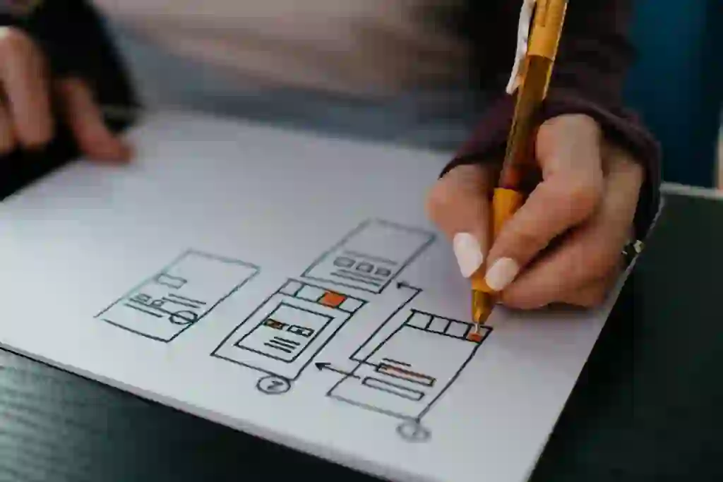
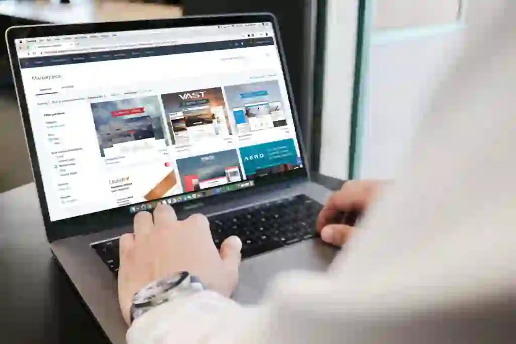
The design of your Shopify store has a vital impact on your store’s layout.
Let’s take a look at some simple design tips that can boost your conversion rate and improve your user experience.
Simplicity is key
Utilising a simple design in your ecommerce store is, in general, much better than overcomplicating it.
You don’t want to confuse your users by having an excessive amount of elements on the page.
The more random elements you have (like popups, banner ads, and more popups), the worst user experience you are delivering.
This doesn’t mean you shouldn’t include any other elements, however it’s important to look at your site from a customer’s point of view and make sure they won’t get distracted from your key message.
Add social proof
Adding social proof is a very simple way to increase your design’s effectiveness and improve your conversion rate.
This can be done by adding testimonials from real customers demonstrating your product’s effectiveness.
You can also add customer reviews to your products so new users feel more comfortable purchasing from your store.
Adding social proof adds trust and is usually fairly simple to implement thanks to the large amount of third-party reviews like TrustPilot.
Make it easy to navigate
Having a clear, easy-to-use navigation bar is vital to your store’s design.
It should be easy for users to find what they are looking for, they shouldn’t have to dig through 5 different menus and pages to get where they need to be.
Navigation is not just limited to your main navigation bar, it’s also important to have useful sub-categories.
For example, on a clothes category page, having links to specific sub-categories like t-shirts, pants, etc. can make it much easier for the user to find what they are looking for.
Make it responsive
Responsiveness is key in 2024.
A large sum of your store’s traffic likely comes from mobile.
That’s why it’s crucial, your store’s layout is mobile friendly and well optimized for mobile users.
A poorly optimized mobile experience, can drastically hurt your conversion rate.
Need help optimizing your store layout? Sign up for a development subscription, we’d love to help you out.
Use high quality images
Using high quality images can improve the impression your brand and products have on your potential consumers.
This means uploading high resolution photos as product images, ensuring all banners are high-quality as well as icons throughout your store.
Wrapping up
We hope you’ve found this article helpful.
Key Takeaways:
- Simplicity is key
- Uitilise social proof
- Make navigation easy
- Make your design mobile-friendly
- Use high resolution images
If you’ve found this article useful, we’d recommend checking out our article on ecommerce checkout best practices so you can optimize your checkout as with your design.


